Package Redesign: Vrij
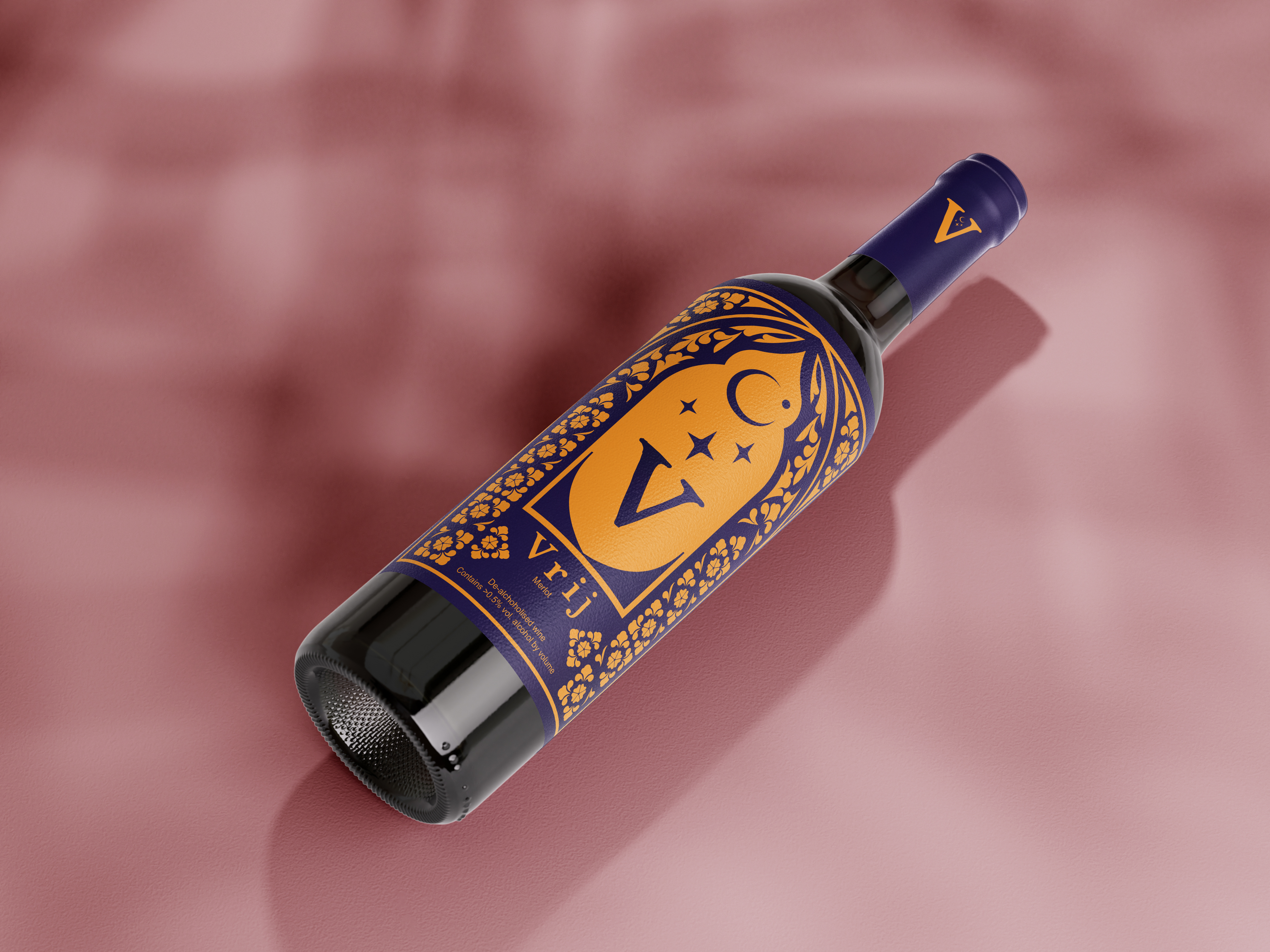
For this Design 4 assignment, we were tasked with redesigning the packaging for a beverage of our choice. In the spirit of Ramadan, I decided to redesign the lable for a non-alcoholic merlot by the company Vrij.
The label uses bold gold with a complementary indigo to create a striking but elegant impression on consumers. The ornate, floral border, serif "V" letterform, and archway evoke a sense of tradition and history, while the simple pallete feels contemporary.
Thematically, the use of gold on indigo creates a celestial feel, and nods to the nighttime fast-breaking meals enjoyed by Muslims during Ramadan.
See More
Brand Book: Gryd
TDC: Ascenders